How do people shop for customized promotional products?
Context
Delta CX was brought in to perform generative research and redesign of the Google Shopping landing page for a US e-commerce website selling customizable promotional products. Our client wanted to gain a better understanding of who their audience is and what could be improved on the website. Specifically, one of their primary goals was understanding how the Google Shopping landing page performs and could be altered, especially given their significant monthly recurring advertisement expenses.
The entire project took 3 months to complete. Our research revealed that while the landing page and the very similar product detail page had their issues, the main challenges shoppers were facing were with other website areas, specifically the design lab and checkout sections. Our selected research methodology, approach, and tasks allowed us to deeply analyze and understand shoppers’ decision-making processes, tasks, preferences, needs, and where they gain or lose trust in vendors and their products. We fully incorporated this knowledge in our landing page redesigns and subsequently tested our assumptions with real users.
Team
Debbie Levitt – CX and UX strategist, researcher, architect, and trainer
Larry Marine – Senior UX Analyst, Researcher, and Designer
Ralica Parusheva – Assistant Researcher
Piermario Orecchioni – Interaction Designer
Elijah Claude – Interaction Designer
Research goals
- Observe and analyze what is the customer experience on our client’s and on competitors’ websites;
- Document what is and isn’t working well, what’s unclear or confusing, insights, opportunities and recommendations;
- Analyze the shopping task and optimize the flow;
- Find out who shops on our client’s website;
- Understand product search, shopping habits and trust signals;
My contribution
- Heuristic evaluation – delivered as an 18-page document with screenshots and short video segments of some problematic website areas;
- Participant recruitment and communication – fully responsible for both the generative research (27 participants in 4 segments) and redesigned landing page usability testing (12 participants in 2 segments);
- Research plan and discussion guide review – my main contribution was feedback and resulted in some additional questions added to the guide;
- Thematic analysis – fully responsible for the analysis and coding of the 27 remote observational sessions in Dovetail breakdown into key themes and insights. Over 100 hours spent on this task;
- Task analysis – fully responsible for the outline of the shopping task broken down into 4 major phases and 5 sub-tasks;
- Personas review – my feedback resulted in the addition of a persona;
- Research report contributor – heavily involved in the executive summary section and the review of the entire report content;
- Participant video montages curation and compilation – theme-specific video clips with an average length of 10-15 minutes with key interview highlights on 10 topics exported from Dovetail;
- Issue list consolidation – fully responsible for the categorization of 136 issues and outlining recommended solution approaches.
Process
This project consisted of a research and design phase, where the design was fully informed by the research findings and subsequently further usability tested prior to client handover.
Deliverables
Heuristic evaluation
I was one of 3 evaluators who carried out a heuristic review on the client’s website. We each did our assessments separately and then the Lead researcher combined our findings in a single presentation. My approach was to inspect website areas like home page, navigation, forms, account management, checkout, design lab, search, product detail pages, product family pages, etc., and document in a Google doc whether they conform to established usability practices and standards.
The evaluation was based on Nielsen’s heuristics. I also referred to David Travis’s web usability guidelines during the assessment. To make certain issues clear I created short video segments (10 in total), displaying specific behaviours with relevant commentary – those were made using the Chrome extension Nimbus.
Thematic analysis
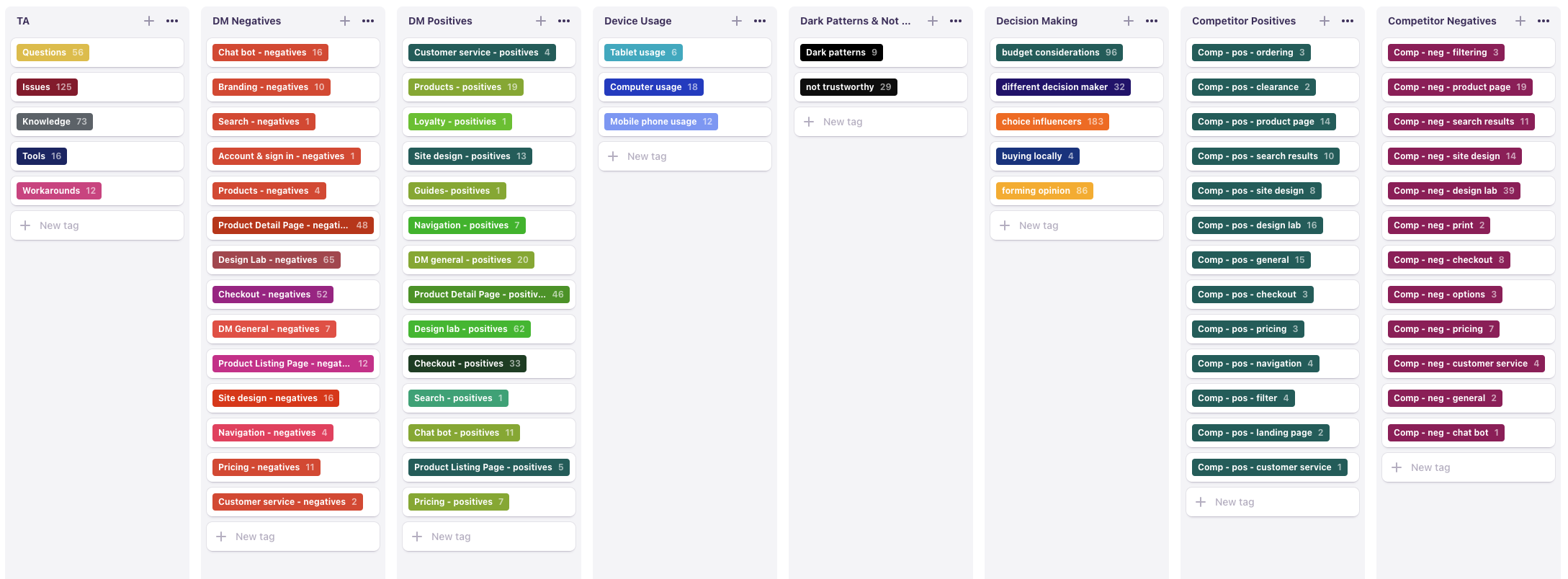
We used Dovetail for the transcription, analysis, and video montage work. I was entirely responsible for the processing of all 27 sessions, whose combined length was over 24 hours of video material. This was not trivial to analyze as each session was split into 3 major parts. The interview started with an introductory section of about 8 general questions prior to the task, continued with the task itself accompanied by contextual questions, and ended with another set of 8 questions after the task completion. As a result, the majority of the sessions were very information-dense and took on average around 4 – 5 hours each to process.
The nature of the discussion guide heavily influenced the initial tagging structure, which wasn’t only aimed at website elements (whether client or competitor-specific), but also task analysis themes like issues, workarounds, tools, and various topics like shopping habits, device usage, trust signals, motivators and decision making factors. Our study also explored the impact of COVID-19 on shopping frequency and habits.
Because of the sheer number of information and tags (over 2500), some of the highlights and themes in general needed rework and additional breakdown, which I did after watching all the interviews. Some tags, especially issues happening during the observational part were supplemented by comments associated with the tag for more clarity.
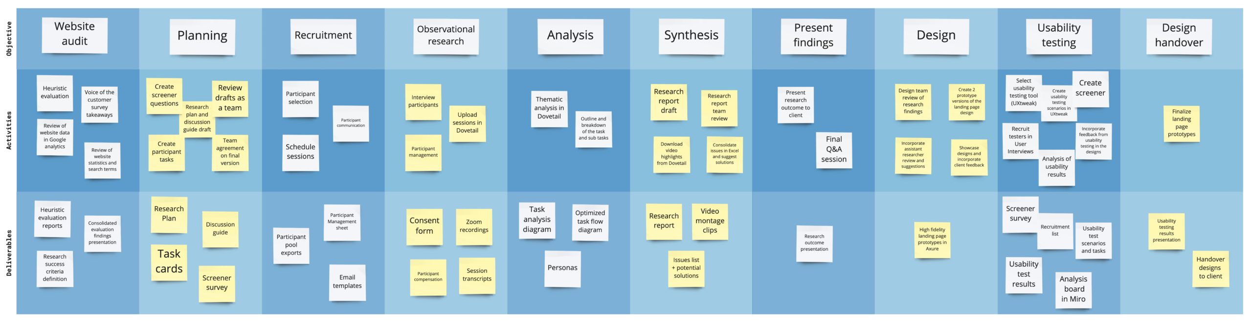
Task analysis
The embedded file below contains an excerpt of the task analysis I did for our client. The Purchase step is shared with permission – the full task analysis is confidential and captures the entire shopping experience as observed in our primary research data.
The first draft of the task analysis was done on the basis of approximately half of the interviews. My main goal at that stage was to capture steps I repeatedly saw and describe common activities shoppers did. The final version was completed after watching 90% of the sessions and subsequently shared with the client. The task analysis was done entirely in Miro and took approximately 12 hours to complete.
My approach to this deliverable tries to stay faithful to the commonly accepted coloring scheme and principles – green for tasks, purple for tools, artifacts, knowledge and workarounds, orange for issues and questions. However, I also prefer to incorporate my own modifications, like optional paths and in this particular scenario exit points. Those were based on observed deal-breaking moments or participant statements.
Usability testing
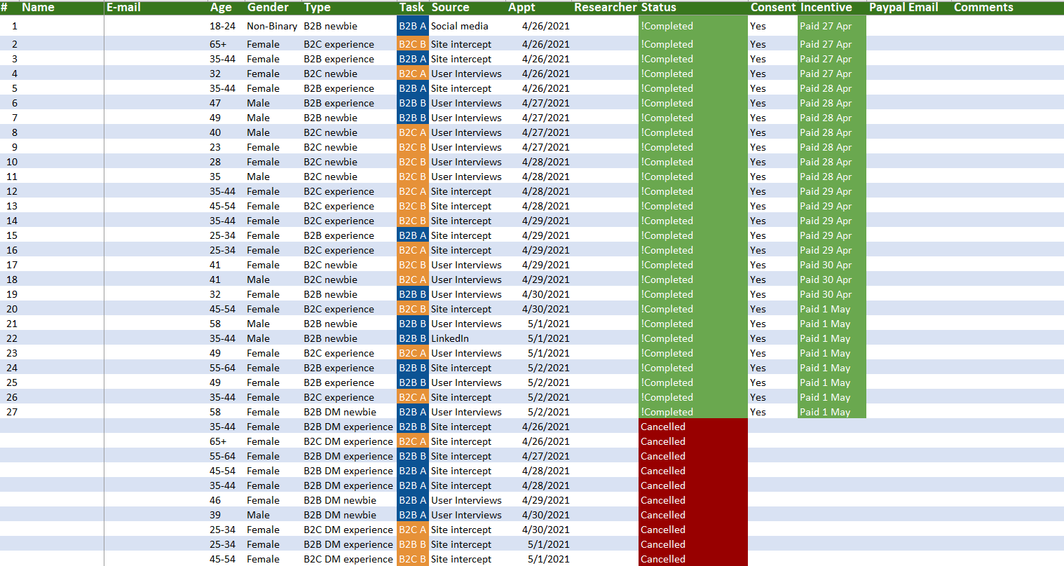
I did the recruitment for the test using User Interviews. We ran a short screener and had 2 participant segments – B2B and B2C. My preference was to recruit a more diverse group and have an even split between male and female participants. This was a remote unmoderated study we ran in UXtweak. Selected participants were provided a segment-specific link.
The design team created 2 versions of the product landing page, where one of them was more traditional and the other had some experimental features, most notably an implementation of a mini design lab. Both pages incorporated the research findings, but in a slightly different way, which made for an interesting comparison test. Both of the prototypes were high fidelity, with working page interactions, calculations and were made using Axure.
The test consisted of questions prior to and after the test, showing both pages in random order to minimize bias stemming from page order, giving the same task on both pages and asking people to think out loud. We had a very high task completion rate and the majority of testers remarked how much they appreciated the tools our landing pages offered to accomplish the objective. One of our post-test questions was to indicate preferred page design. Interestingly enough the split was exactly 50/50 and we had a number of findings on what to keep and how to improve further each of the designs.
The analysis of the results was done in a Miro board, where my findings were combined with the observations and findings from the interaction design team and were subsequently consolidated into a presentation, which our Lead researcher shared with the client.
Challenges
Estimates
With pressure from the client to have everything finished in 3 months, the project had to be rushed and the timelines for a lot of the deliverables were optimistic. Despite this, through great collaboration, communication, and team effort we were able to meet client expectations and the committed schedule.
Problem:
Due to the research plan changes, the original time estimates were no longer correct. The client approved a small amount of additional work, and the project plan had to be re-estimated. Estimates didn’t account for a significant number of the necessary work, in particular recruitment and analysis.
Solution:
Switched the responsibility for certain deliverables to make up time. For example, to make up for the recruitment and analysis time specifically, deliverables like personas, optimized task flow, and report consolidation were taken by one of the senior researchers, and the assistant (myself) had to only review and comment on the work as opposed to being fully responsible for it.
Problem:
Initial data gathering, evaluation and research planning took 2 weeks longer than anticipated.
Solution:
Instead of conducting the observational research over 3 weeks (the original plan) the interview work was done over the course of one week (including weekend slots). This required rigorous and quick recruitment, scheduling and coordination, but was successfully accomplished.
Recruitment
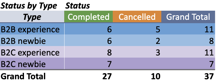
The initial idea was to recruit entirely from a site intercept and the expectation was that this would save a lot of time. During planning, this was changed to a desired 70/30 split between existing customers and people new to the site. Our adjusted target ratio including floaters was 28 participants out of which 14 business to business (B2B) and 14 business to consumer (B2C). For each category, we wanted 4 participants without site experience and 10 with site experience. This evolved further during the actual recruitment (for more details refer to the Problems and solutions section).
Total invites sent:
B2B experience – 54;
B2C experience – 45;
B2C & B2B newbies – 18;
Problem:
Participants were sourced from two user pools – one in Alchemer from an intercept on the client’s website to capture current visitors or customers and the other in User Interviews. This introduced additional complexity and overhead with checking new responses, consolidating participants lists, daily exports, narrowing down, following up, and making sure information on who was contacted and scheduled is accurate, up to date, and reliable.
Solution:
Exported raw data, performed a quick analysis of responses, and narrowed down based on factors like quality of the response, candidate relevant data (LinkedIn, email). Color-coded participant candidates, filtered on color code, and followed up with selected candidates. Instead of consolidating lists, tracked people who have been contacted and split per segment and expected action. Created a participant management sheet for the scheduled participants to consolidate and document recruitment outcomes.
Problem:
Managing study outreach, scheduled and free interview slots.
Solution:
Initially, sending out 2n invites, which eventually grew to 4n, to account for the actual number of responses, no shows and scheduled sessions. Re-invited some of the participants after a week – only once per person. Identified which segments were harder to recruit and proactively suggested tasks to participants in the segment with fewer scheduled sessions. Recruited more from certain segments, which proved easier to schedule and more insightful. Last but not least, created scheduling links, which expire upon reaching a specific number limit and inform the participant automatically that there are no available time slots.
Problem:
40% of the screener respondents reported both B2B and B2C experience. We had different tasks and follow-up questions for B2B and B2C shoppers, so had to put people in one of the two categories prior to scheduling the observational sessions.
Solution:
Identified the participants who fit both categories. Afterwards, followed up via email to inquire about preference or directly suggested a possible task (based on study needs). This evolved even further to include a prompt, explaining they fit our study and if the suggested task matches preference, directing to a scheduling link, as opposed to waiting for a follow-up of what type of task they prefer.
Tools
Initially, we wanted to use Descript for the analysis of the recorded Zoom sessions and the video montage work. We used Alchemer for the screening of participants coming from an intercept on our client’s website. Our scheduling tool was Acuity.
UXtweak was our platform of choice for the usability tests and User Interviews to recruit for both the observational study and the usability tests. After processing the first observational session, we discovered that Descript was not a good fit for our analysis needs and we switched to Dovetail.
Problem:
User Interviews as a platform doesn’t allow links to external survey tools like Alchemer.
Solution:
Recreated the screener in User Interviews, worked on both platforms in parallel, and managed participants separately via an Excel sheet.
Problem:
Comments in Descript could not be edited and the tool offered limited support for coding of the interview sessions.
Solution:
Switched to Dovetail for the analysis work and used the highlights feature to do the video montage exports.
Key Findings
The 65-page report outlined all of our discoveries in significant detail with relevant solution approaches, opportunities, recommended design or research initiatives, and how Delta CX can further assist with their implementation. The findings listed below are shared with permission.
- The design lab doesn’t offer sufficient tools for stress-free customization – expected functions like keyboard shortcuts are missing, while other functions like center and align don’t produce expected results;
- Product listing, product display, design lab, and checkout pages have difficult and confusing areas when shoppers are at key points of their task. These moments can become dealbreakers;
- There is a discrepancy in pricing information between product detail pages and checkout areas, which damages trust;
- A popup showing other items with shoppers’ custom artwork interrupts the task right before payment. Many people dismissed the popup without looking at it or absorbing the message;
- Website error messages are unhelpful and confusing, and suggest that people call a customer support phone number. Shoppers are blocked from fixing their own errors, and have to leave their task to speak to support. Many participants indicated they would leave the site rather than call for help.
Project Outcomes
The client was delighted with the research and design work Delta CX did. They implemented a number of the improvements suggested in our report – f.e. adjustments to the home page navigation, header, checkout form, and others. They are better informed about the needs of their audience, which allows them to more effectively address them. They have extensive information on what could be changed further, how, and why. The client’s engineering organization also introduced the new landing page designs for some of their product offerings and reported improvement in performance compared to the previous version.
Being entirely responsible for the recruitment of the participants I was happy to discover during my analysis that each of them provided valuable insights – a conclusion echoed by the Lead researcher. This was crucial to understanding the type of customers who shop on our client website and having an accurate impression of their real needs and challenges.
My thorough analysis work helped set the design team up for success. They could refer to tags with relevant quotes, which specifically described problems with the product detail and landing pages, issues captured during the observational sessions, potential deal-breaking moments, and the detailed breakdown of the task itself. This information was used extensively in the proposed designs. The subsequent usability tests showed testers had a very high task completion ratio (90%) and positively reacted to changes introduced as a result of the observational research findings.
Project Takeaways
1. Improve coding practices
This was my first time using Dovetail. Even though I started with a number of predefined tags, as I went through 24 hours of recordings, I found the need to create new tags or break existing tags into multiple themes. This meant I had to do some rework to include the new tags for earlier recordings. In the future, I would work to use fewer tags to bring together themes and make reporting easier.
2. Adjust estimation approach
While I was not responsible for the project estimation, I was able to work with the project leaders on improving our future approaches to project estimation. The company then created a template for estimating research tasks to be used for future quotes, which took into account task complexity, total hours of recordings, and other important factors.
3. Be mindful of cognitive load
Analysis work is not like recruitment or other types of work because of its extreme cognitive load. Plan for max 4-5 hours of analysis work per day and alternate with simpler tasks to reduce complexity and memory overload. This was built into the estimator template.
4. Recruitment always takes longer
Manage uncertainty with communication templates, scheduling links that expire upon meeting a preset condition, and sufficient buffer to account for time spent waiting, difficult segment, manual work, etc.